
(05)
(02)

(04)
(03)

The problem
Post-MVP, users weren’t engaging with key features due to unclear flows and low adoption cues, limiting early traction and learnings. Scapade was preparing for launch as an early-stage social app, but the product faced three core challenges:
The risk
From a business perspective, the risk was clear:
Without strong activation, engagement, and clarity around core value, user acquisition alone would not translate into retention or long-term growth.
The challenge
The design challenge was to create a cohesive, scalable experience that supported launch goals while remaining flexible enough to evolve post-MVP.
Business goals
Key goals
• Driving early user adoption across iOS and Android
• Increasing engagement signals such as connections, posts, and interactions
• Supporting retention by helping users quickly experience Scapade’s core value
• Enabling future monetization and B2B opportunities without increasing engineering complexity at launch
Impact
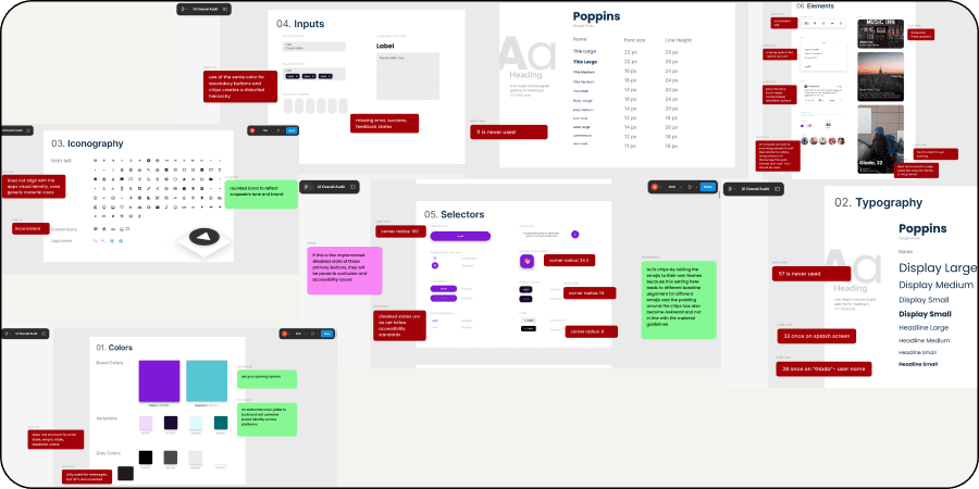
The Audit
I conducted a detailed audit of the app and design system, documenting insights directly in Figma and creating space for team feedback. Collaborated closely with CEO, product, and engineering to identify gaps and align on expectations for the app.
/
00
Screens and system

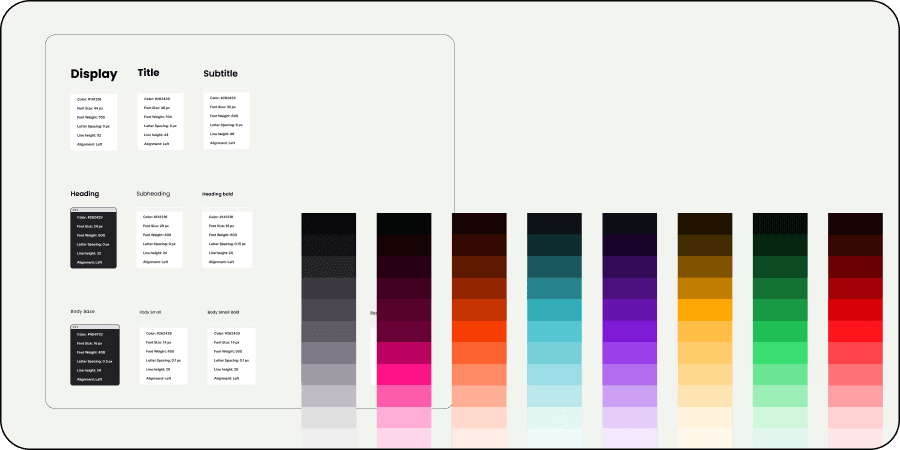
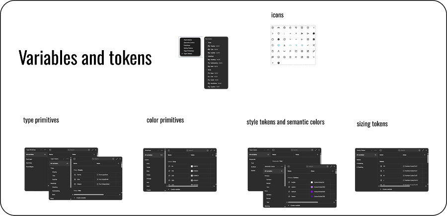
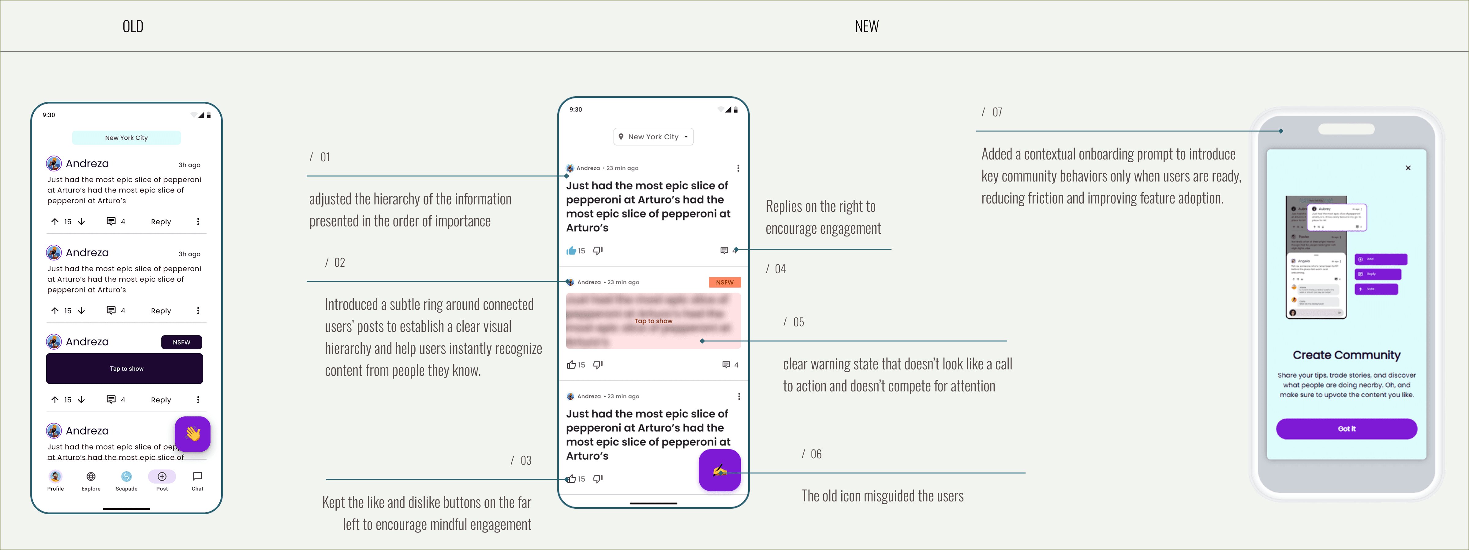
Design system
I established a strong foundation by defining Scapade’s design system creating core tokens, variables, color palette, and typography, and adapting Material Design to reflect the brand’s visual identity. Built custom components to ensure consistency and scalability across the product.
/
00
Variables and tokens
Main app
While the original design focused only on the ideal user journey, I reimagined the experience to include the overlooked moments - edge cases, empty states, and brand-consistent visuals, to make the flow feel complete and human.
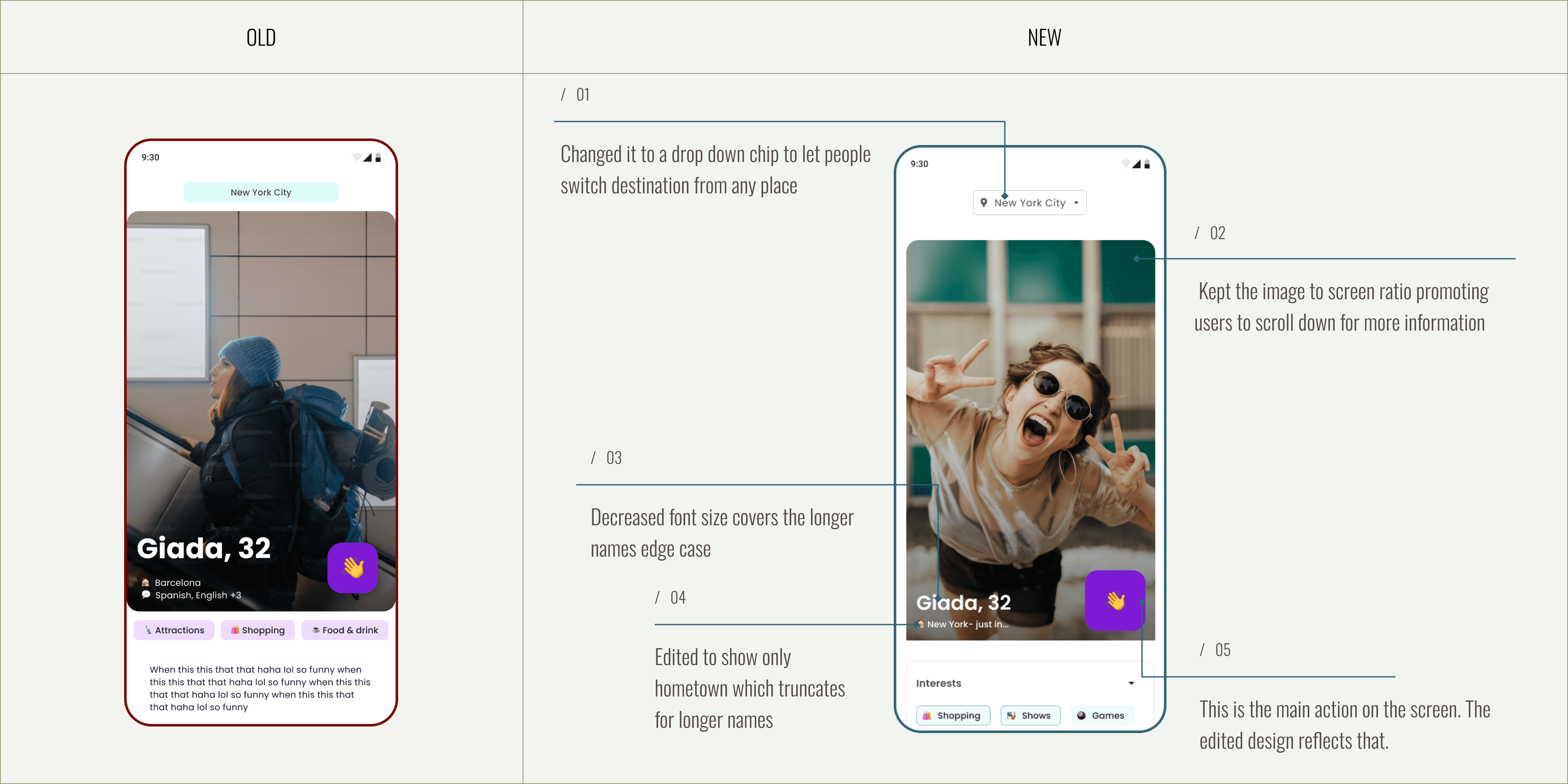
/
01
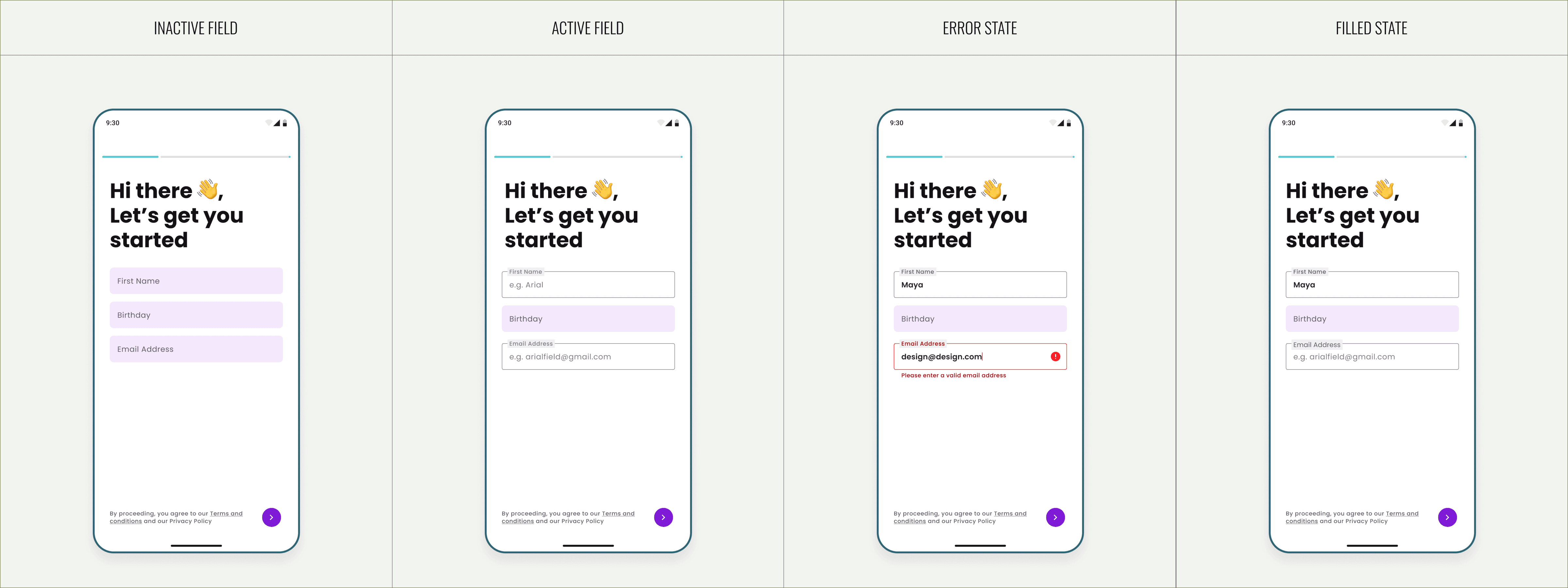
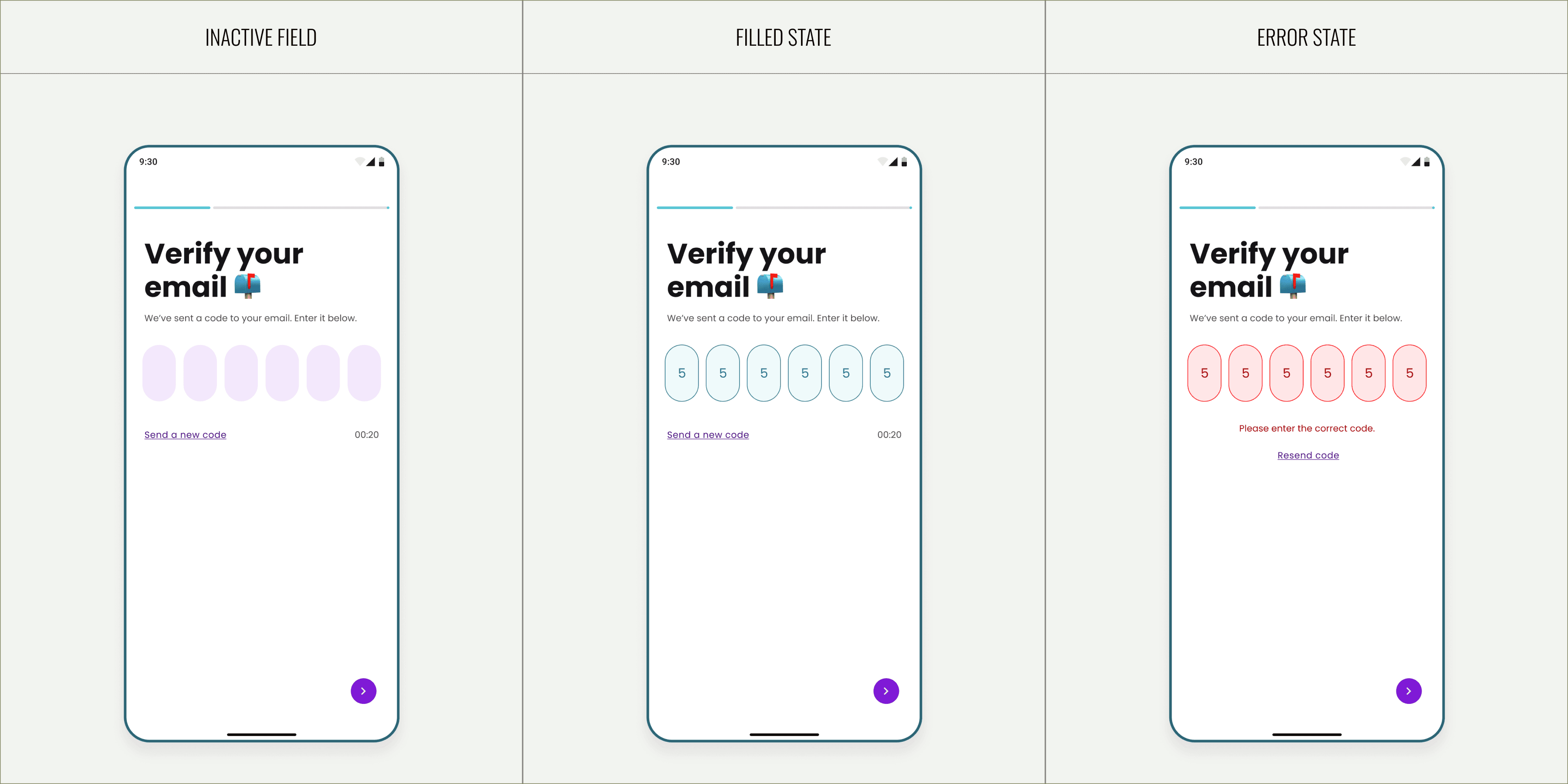
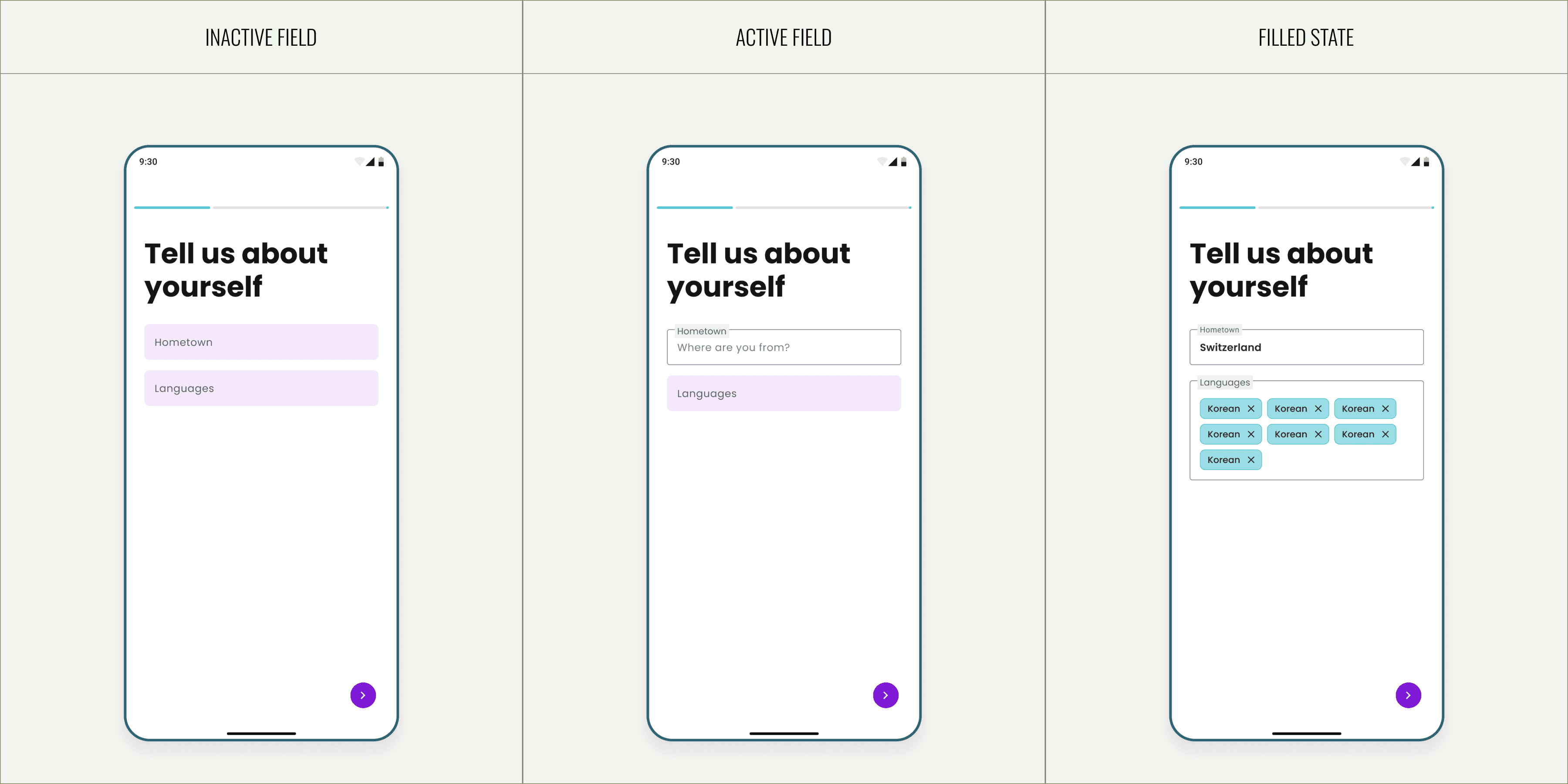
Onboarding flow
/1.1
Basic Information
/1.2
Verification
/1.3
Key information
/1.4
Interests & Destination

/1.5
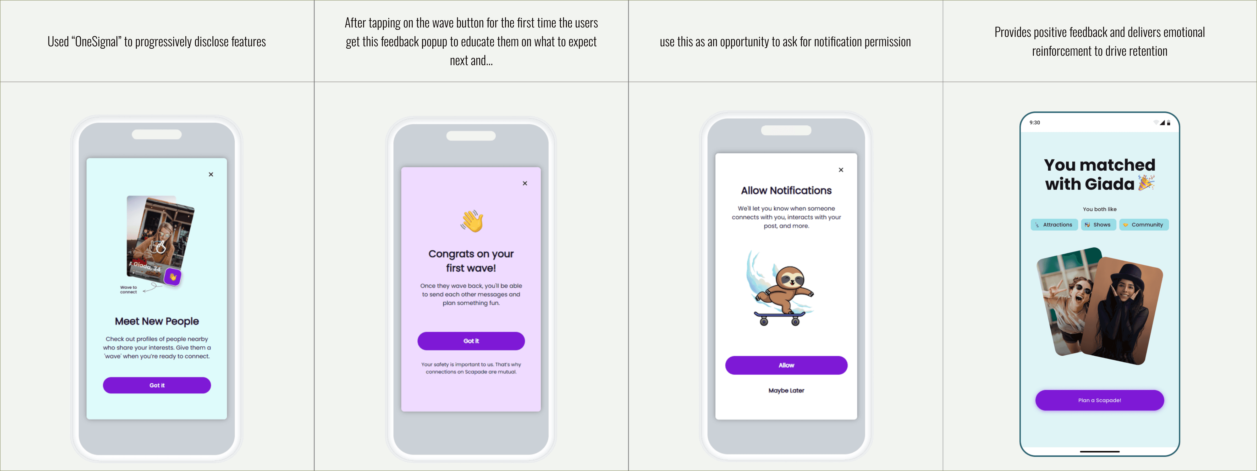
Feedback & Onesignal
To guide users through Scapade’s core features without adding new code-heavy flows, I designed progressive in-app messages using OneSignal. This not only improved user onboarding and awareness but also reduced development effort by reusing the existing messaging infrastructure.

Prompt flow
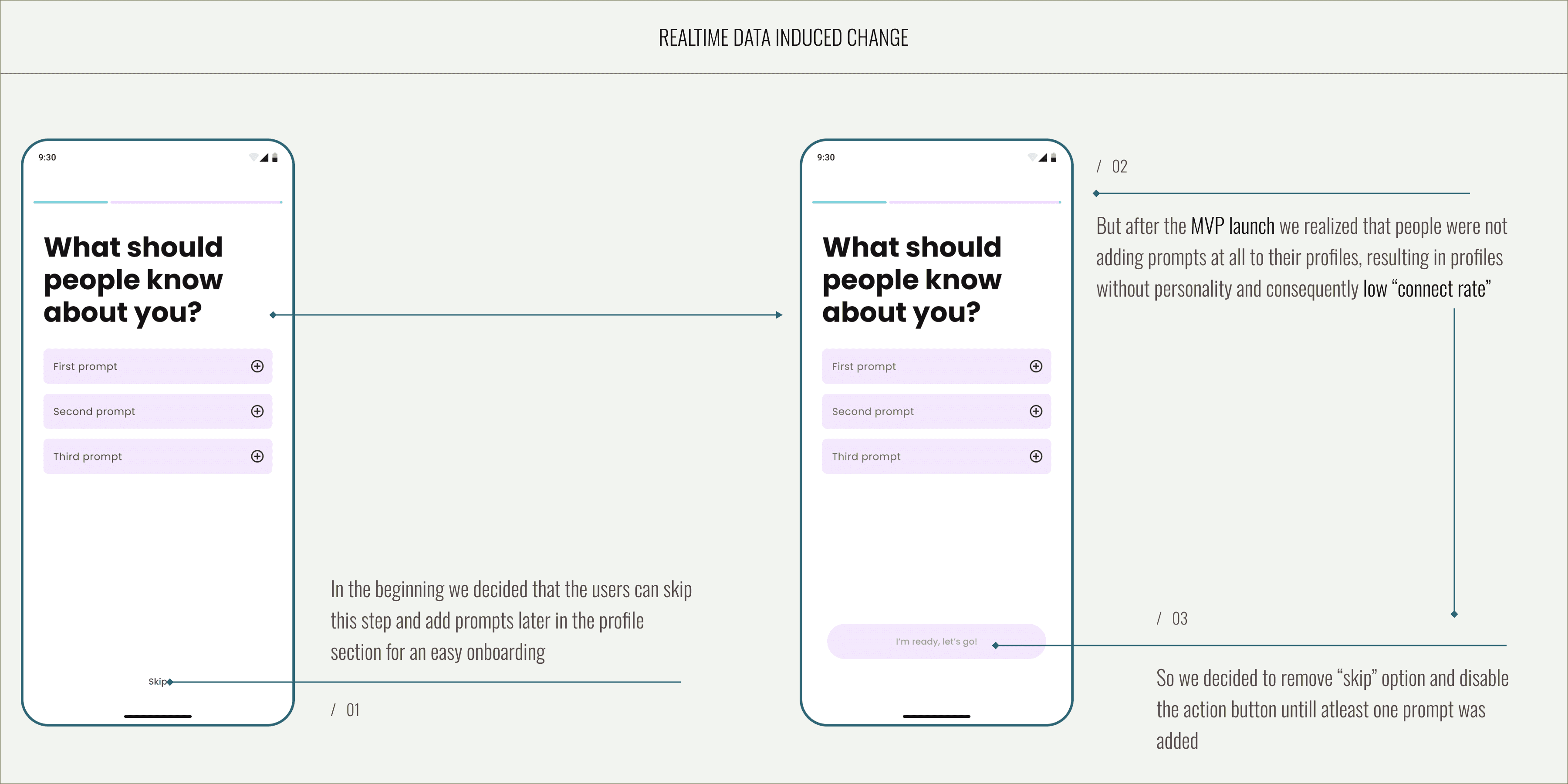
I leveraged post-MVP launch insights to refine the prompt flow, updating visuals and interaction patterns to encourage completion. By replacing the skip action with a disabled primary CTA, the flow now nudges users to add prompts before proceeding.
/1.1
Realtime data induced change
/1.2
Choosing prompt

/1.3
Delete answer flow

/1.4
Answering prompt

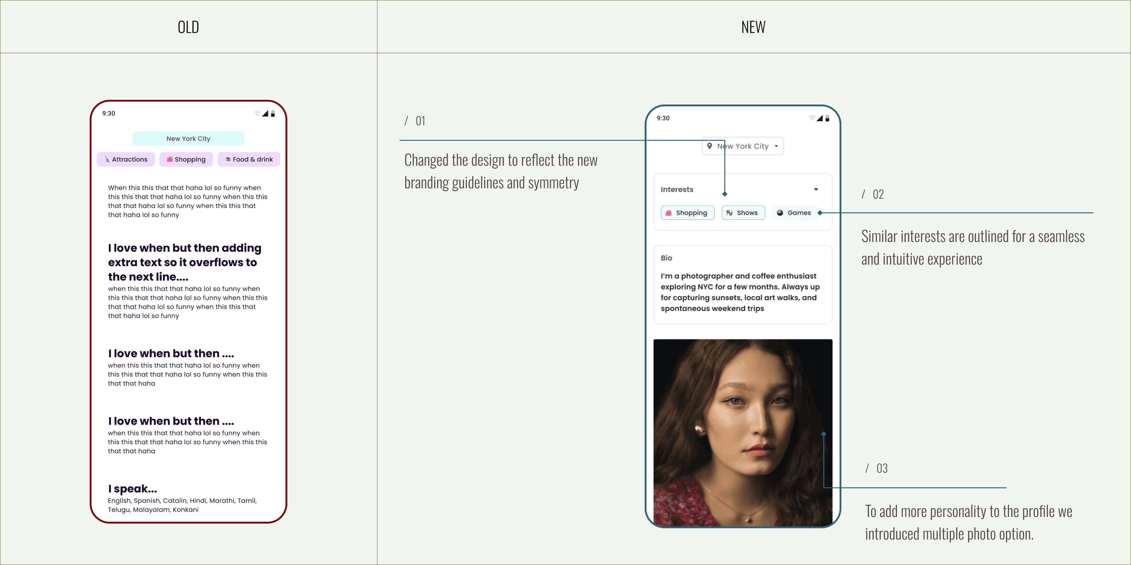
Profile flow
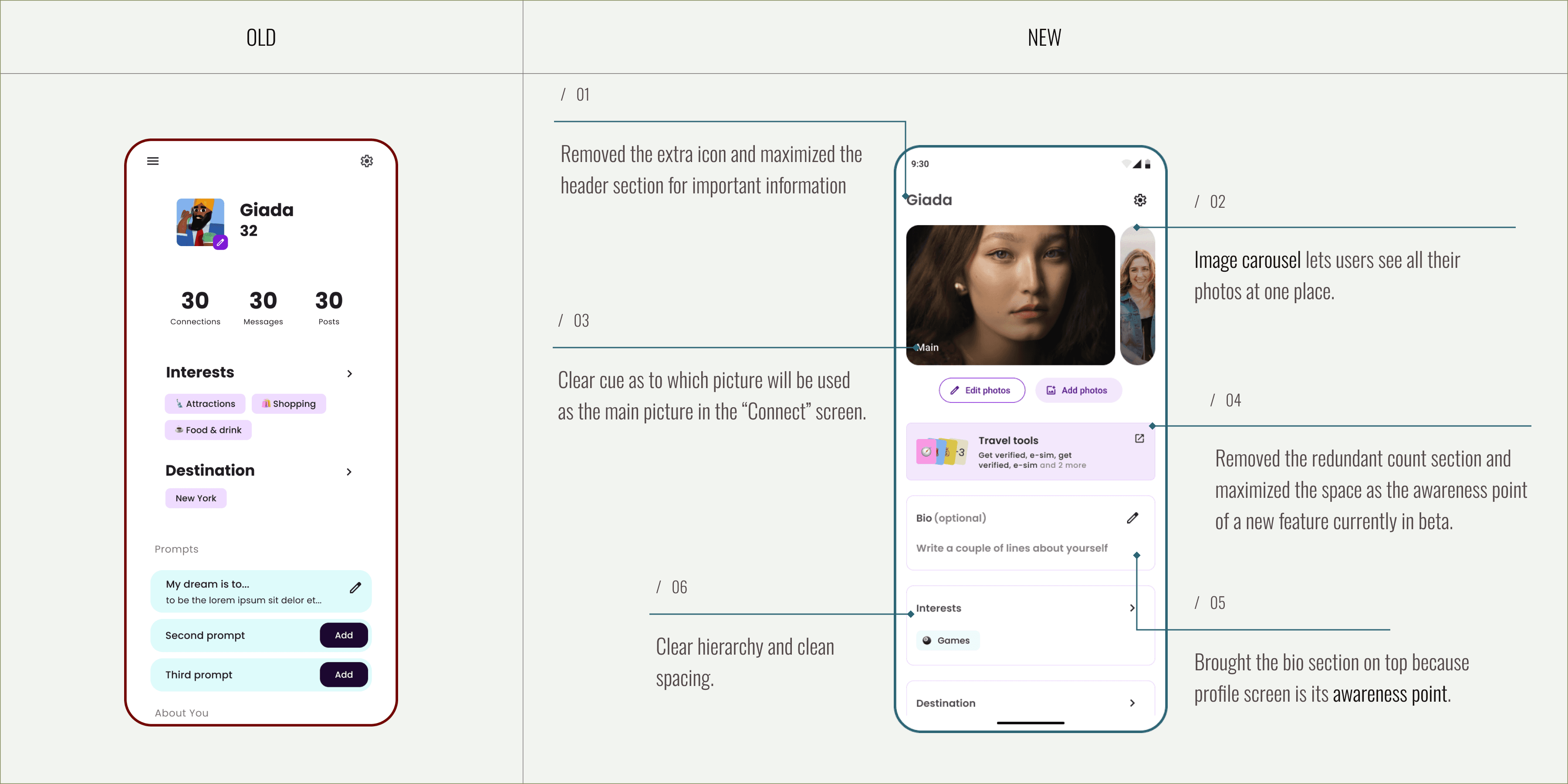
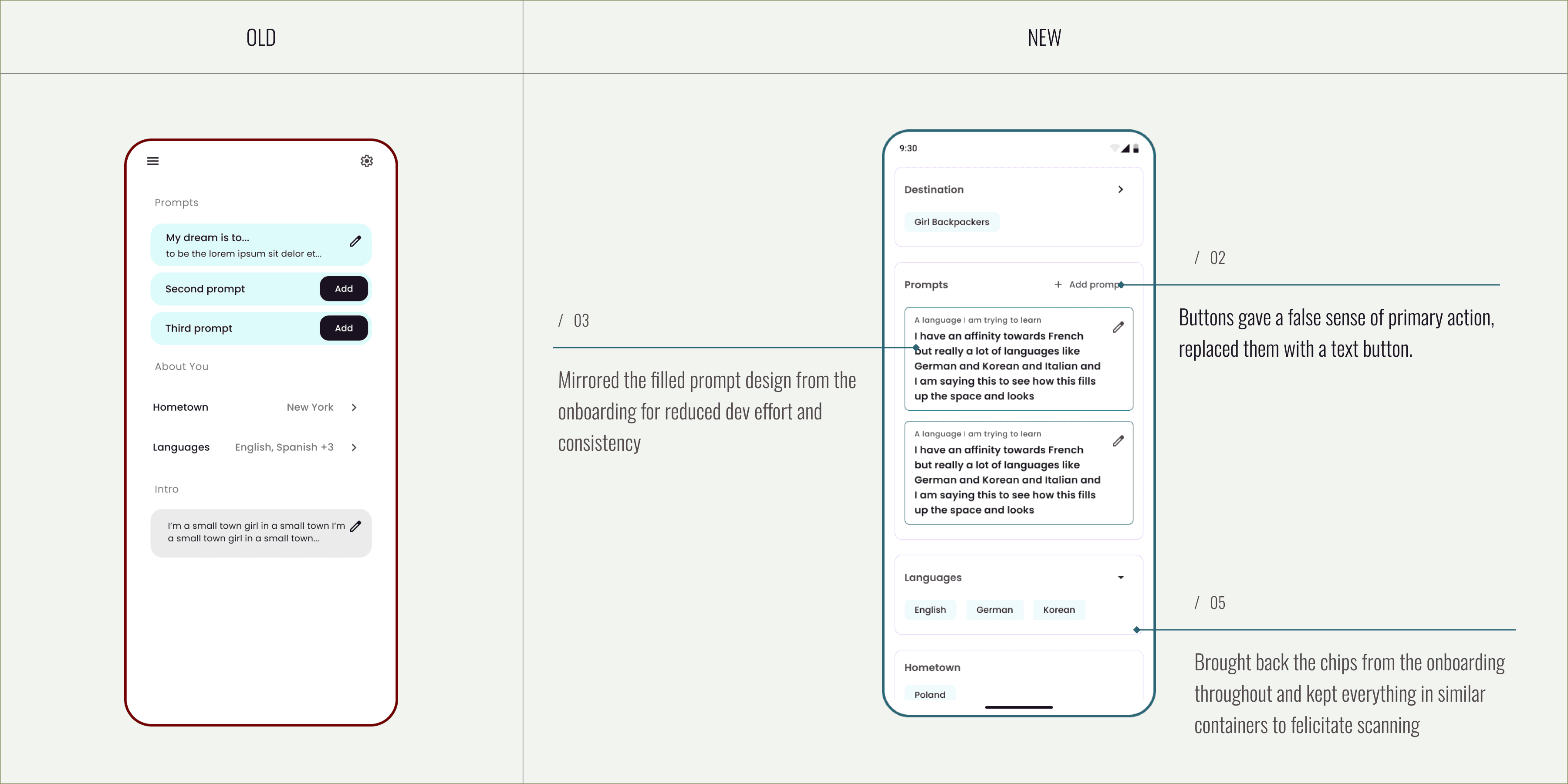
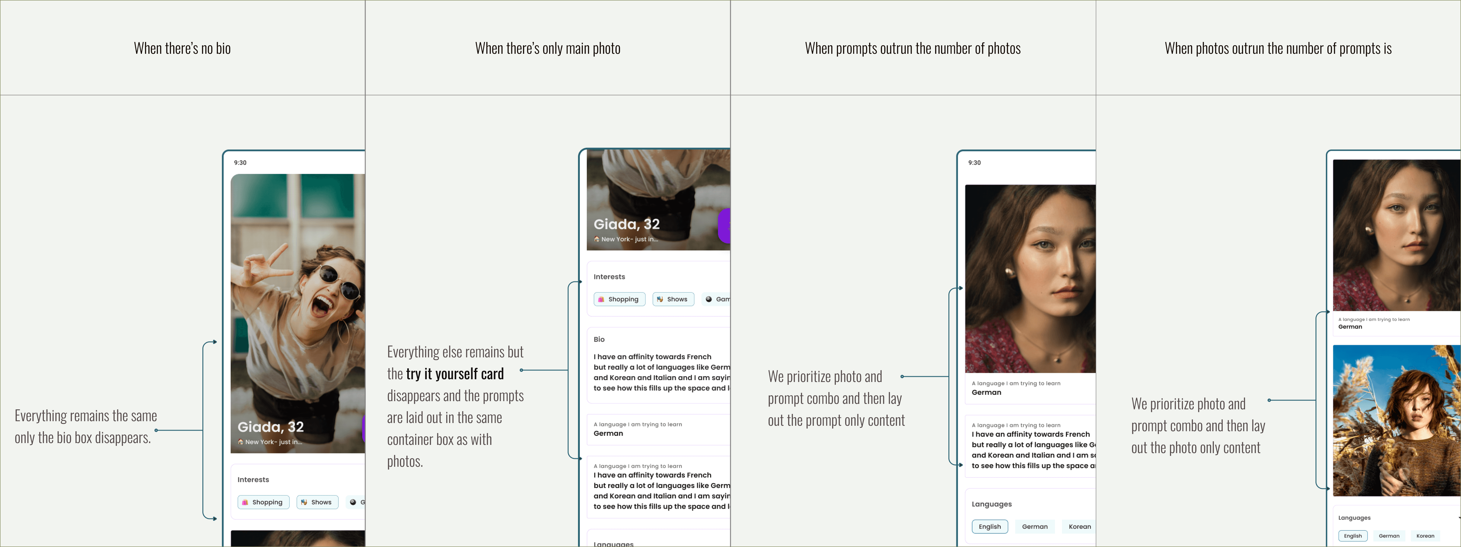
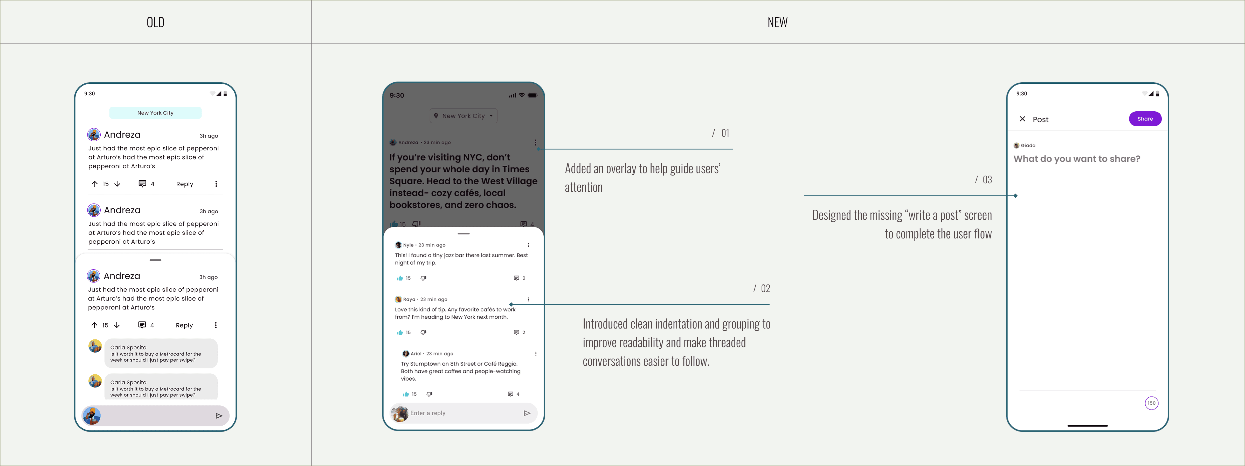
The existing experience lacked clear optimization and user nudges, resulting in low engagement. Visual clutter, outdated patterns, and inconsistent spacing disrupted rhythm and hierarchy. Additionally, an overuse of colors diluted focus rather than guiding attention, and the design no longer reflected the current state of the product.
/1.1
Addressing layout
/1.2
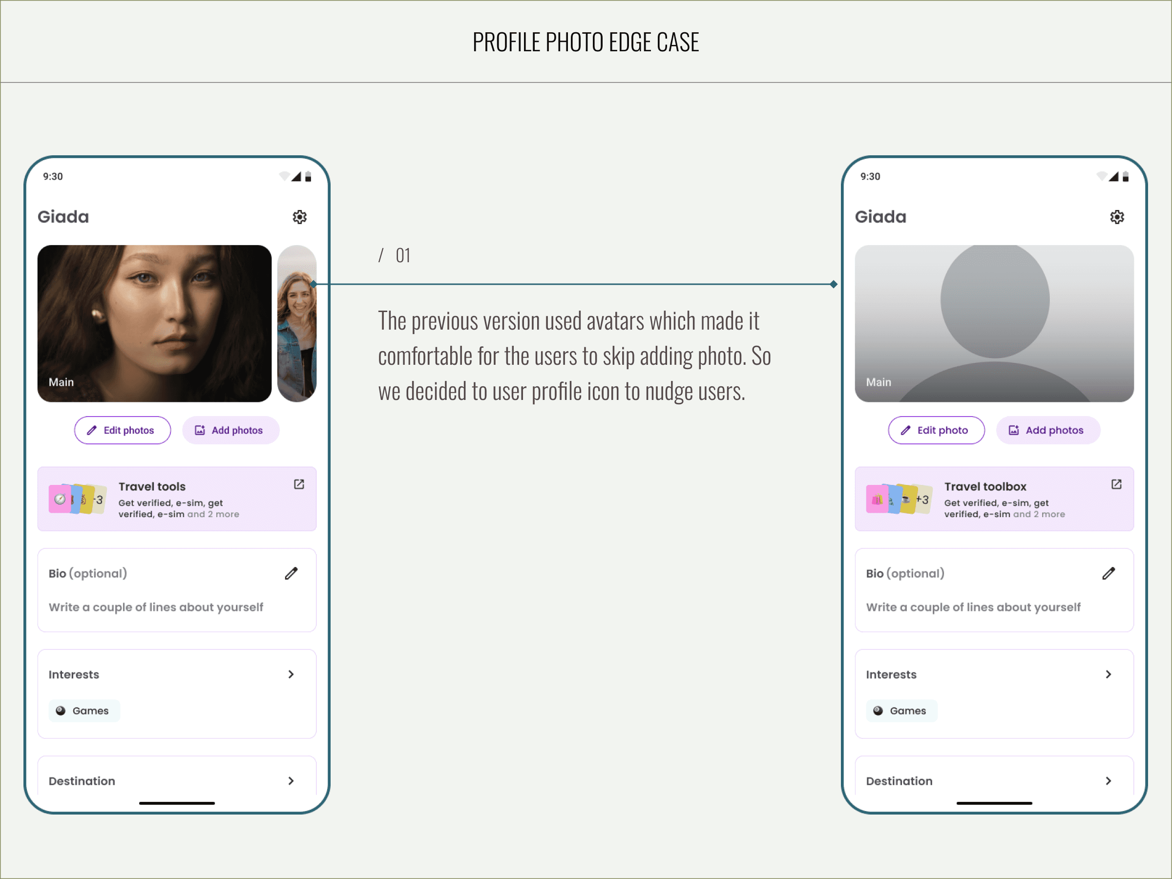
Addressing edge cases
I designed two solutions for the prompt edge case — one prioritizing user experience and another optimized for development feasibility. Given time constraints, we proceeded with the latter for implementation.

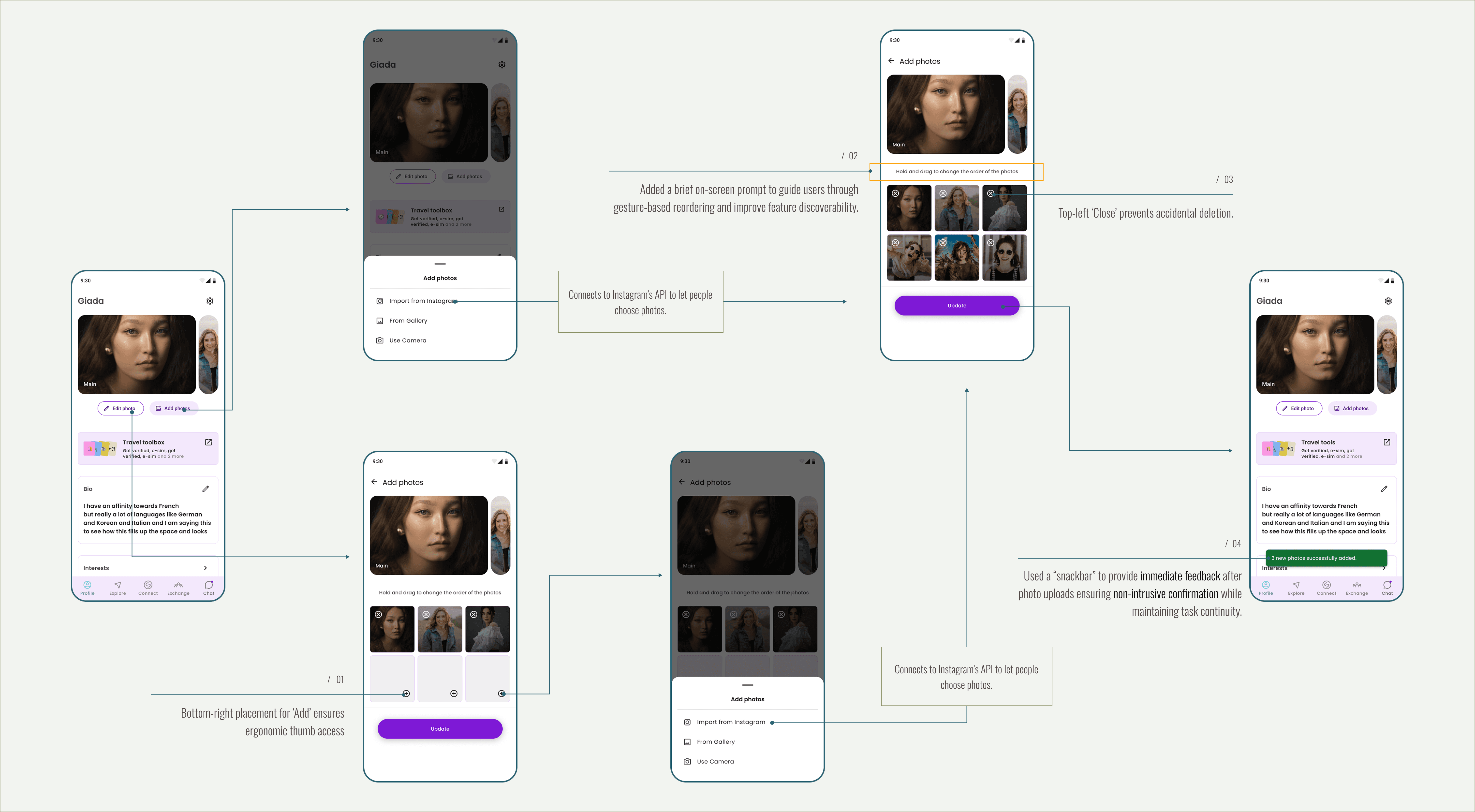
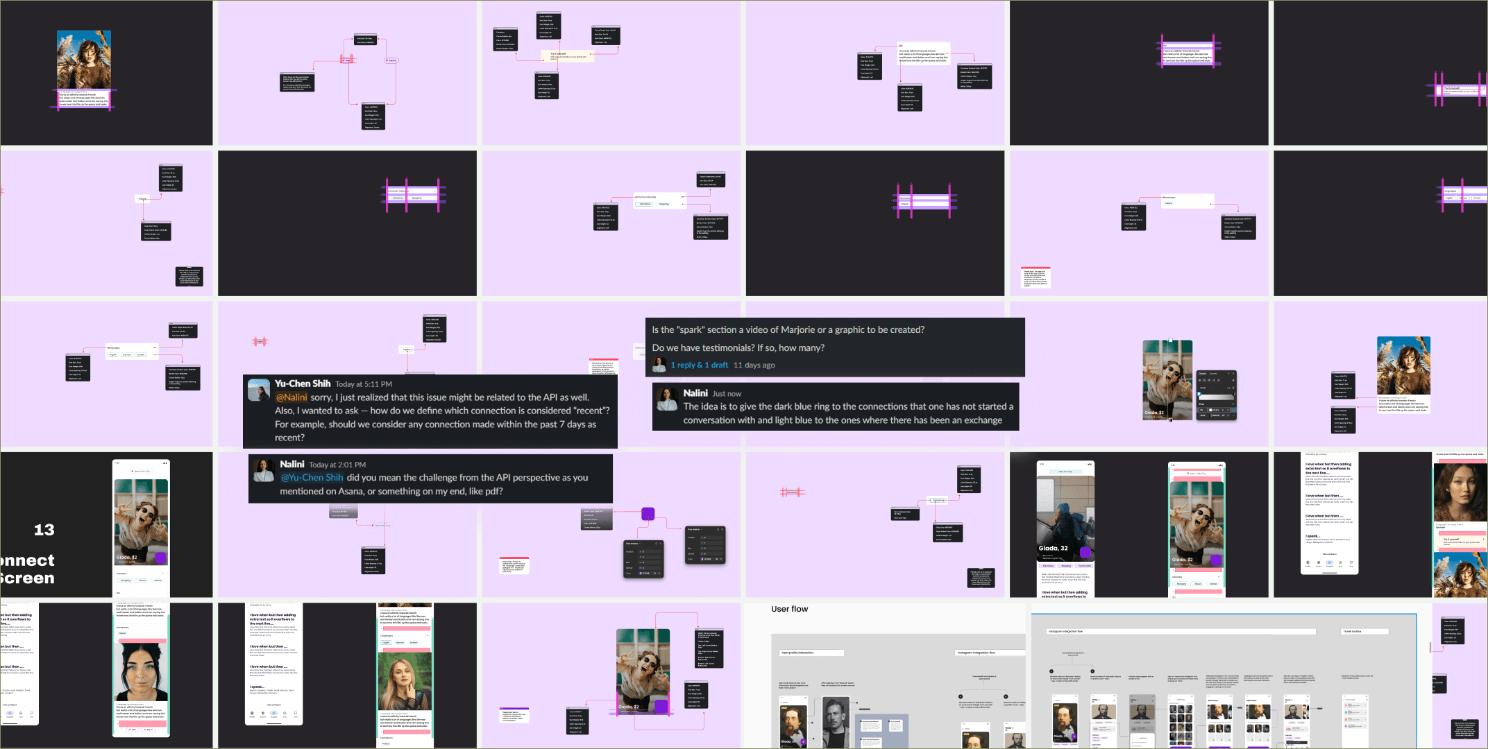
Connect screen
We learned from the user interviews that people would like to see more photos of other profiles to help them decide which profile to connect with.
/1.1
Addressing layout & new features

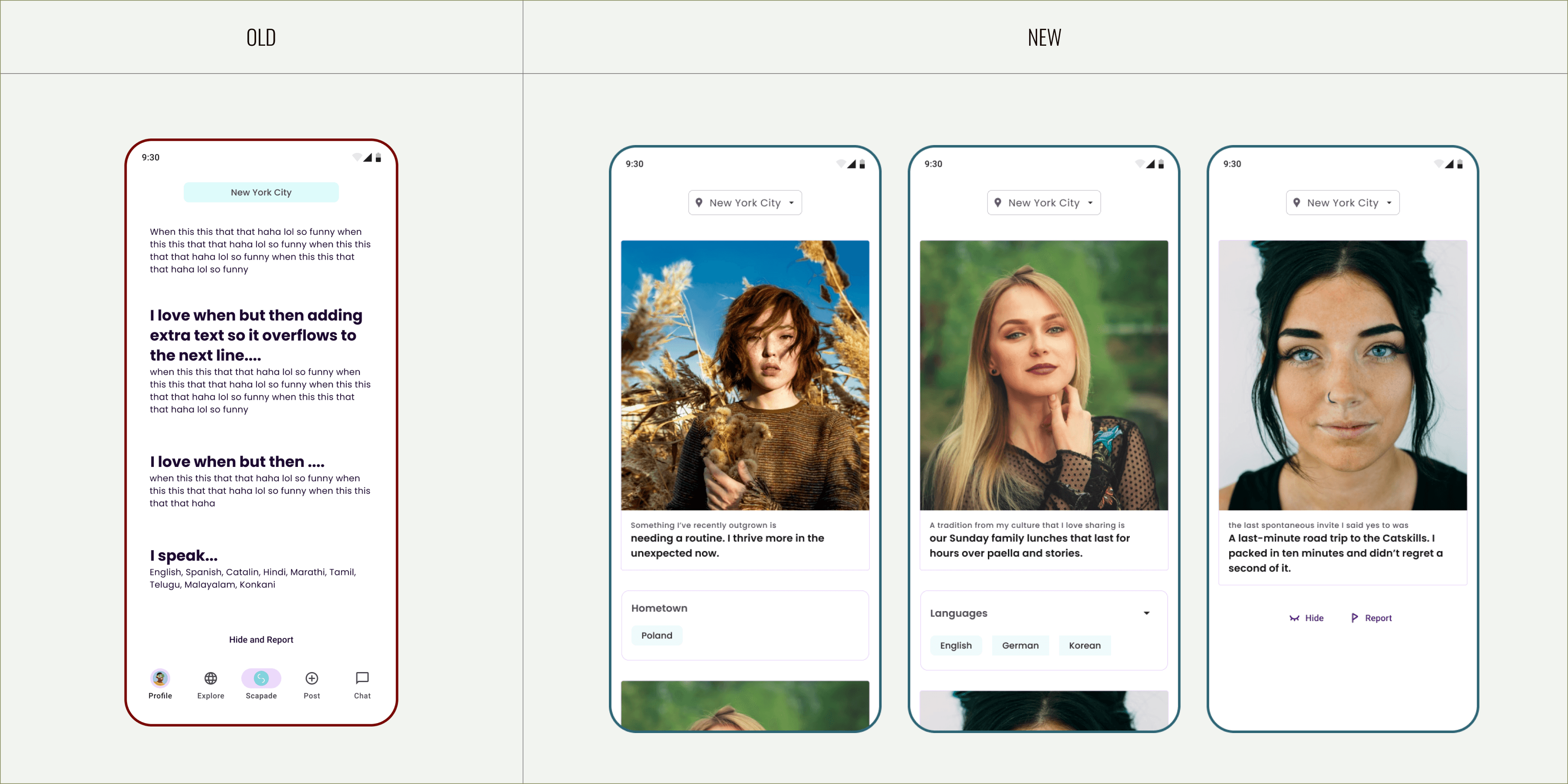
/1.2
Addressing edge cases
I designed notifications and several other screens in OneSignal to guide users through the flow. Additionally, I created a spec for developers that outlined all the edge cases for the Connect screen.
Edge cases & safety scenarios
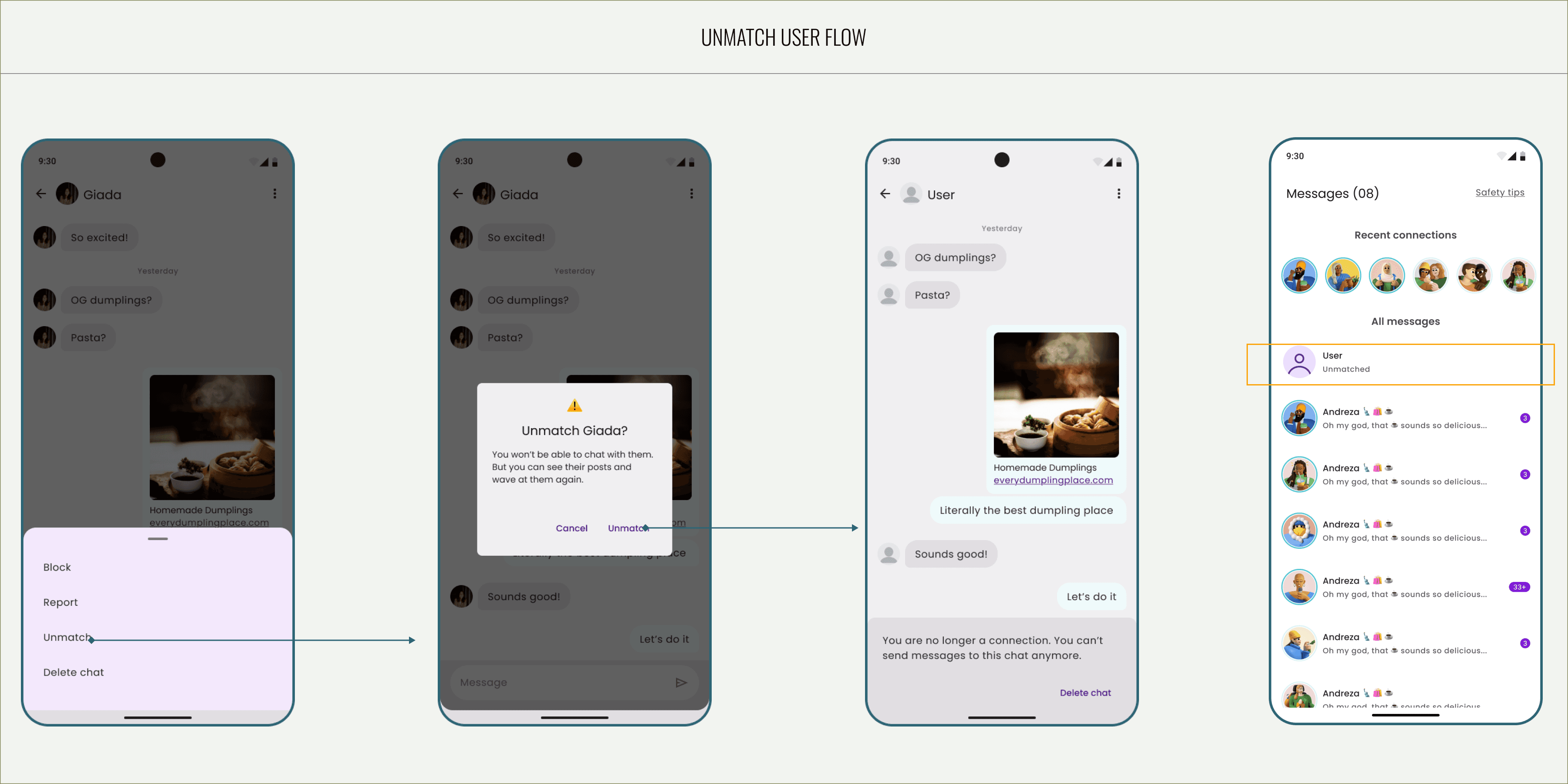
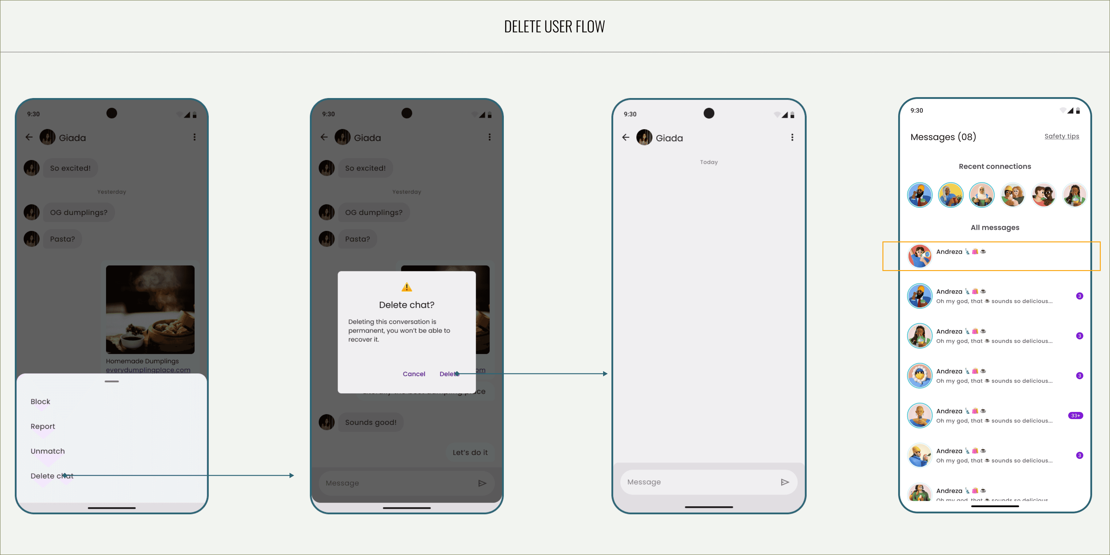
When designing the Report, Unmatch, and Delete flow, my priority was to ensure users felt in control without breaking their sense of safety or comfort. I established a clear hierarchy where “Unmatch” and “Delete” are treated as reversible, self-contained actions, while “Report” leads to a more guided flow that gathers contextual feedback. Each action was accompanied by a confirmation prompt to prevent accidental selections, while microcopy was written in a neutral, empathetic tone to avoid escalating emotional tension. The structure also ensures that users understand the consequences of their actions, helping maintain both clarity and emotional trust.
/1.1
Block flow

/1.2
Unmatch
/1.3
Delete flow
/1.4
Report flow

Core user experiences
When designing the Report, Unmatch, and Delete flow, my priority was to ensure users felt in control without breaking their sense of safety or comfort. I established a clear hierarchy where “Unmatch” and “Delete” are treated as reversible, self-contained actions, while “Report” leads to a more guided flow that gathers contextual feedback. Each action was accompanied by a confirmation prompt to prevent accidental selections, while microcopy was written in a neutral, empathetic tone to avoid escalating emotional tension. The structure also ensures that users understand the consequences of their actions — for example, that deleting a chat won’t remove a user entirely — helping maintain both clarity and emotional trust.
/1.1
Exchange screen
/1.2
Post screen
/1.3
Explore screen

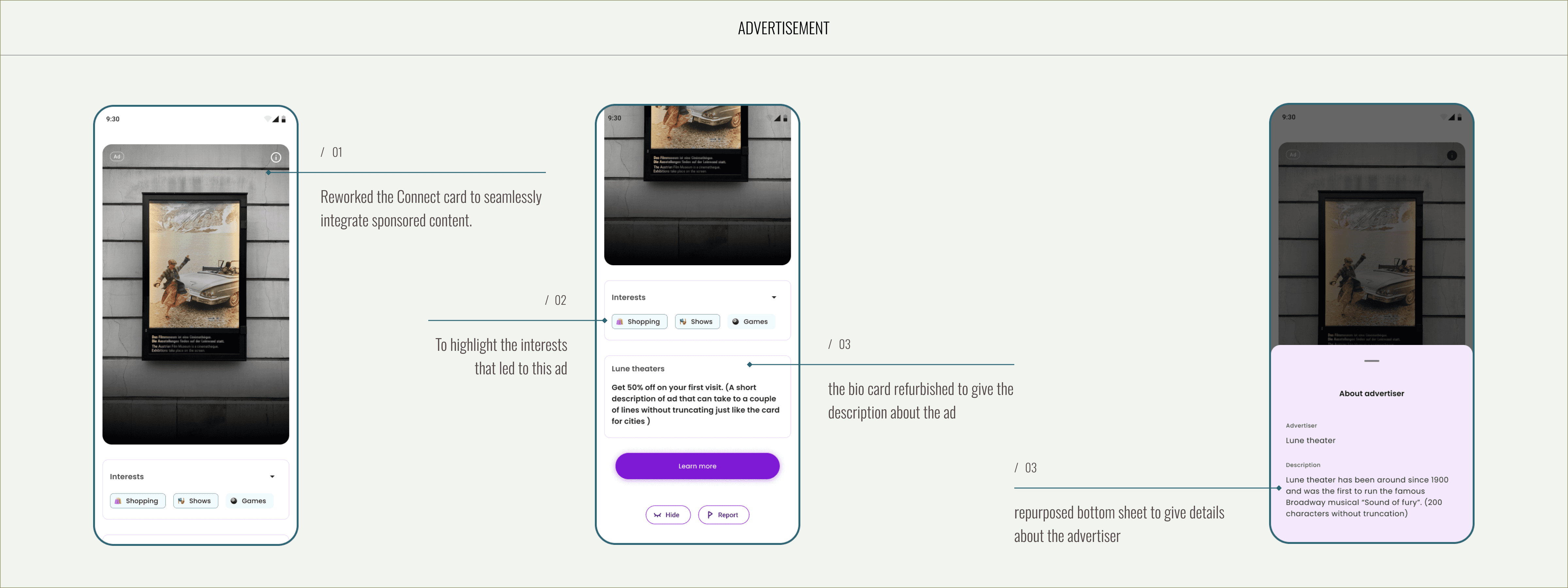
Monetisation model
With Scapade preparing to introduce ads as a core revenue stream, I redesigned the Connect card to host sponsored listings in a way that feels natural within the matching flow. This approach ensured that monetization could be added with minimal technical complexity and without compromising user experience.
Insta Integration
With Scapade preparing to introduce ads as a core revenue stream, I redesigned the Connect card to host sponsored listings in a way that feels natural within the matching flow. This approach ensured that monetization could be added with minimal technical complexity and without compromising user experience.
Travel tools
We launched Travel Tools as a beta feature to test user interest before committing development resources. To validate the idea, I designed and implemented the feature as a Wix-based external link within the app ecosystem, allowing us to measure user traffic and behavior with minimal development effort.
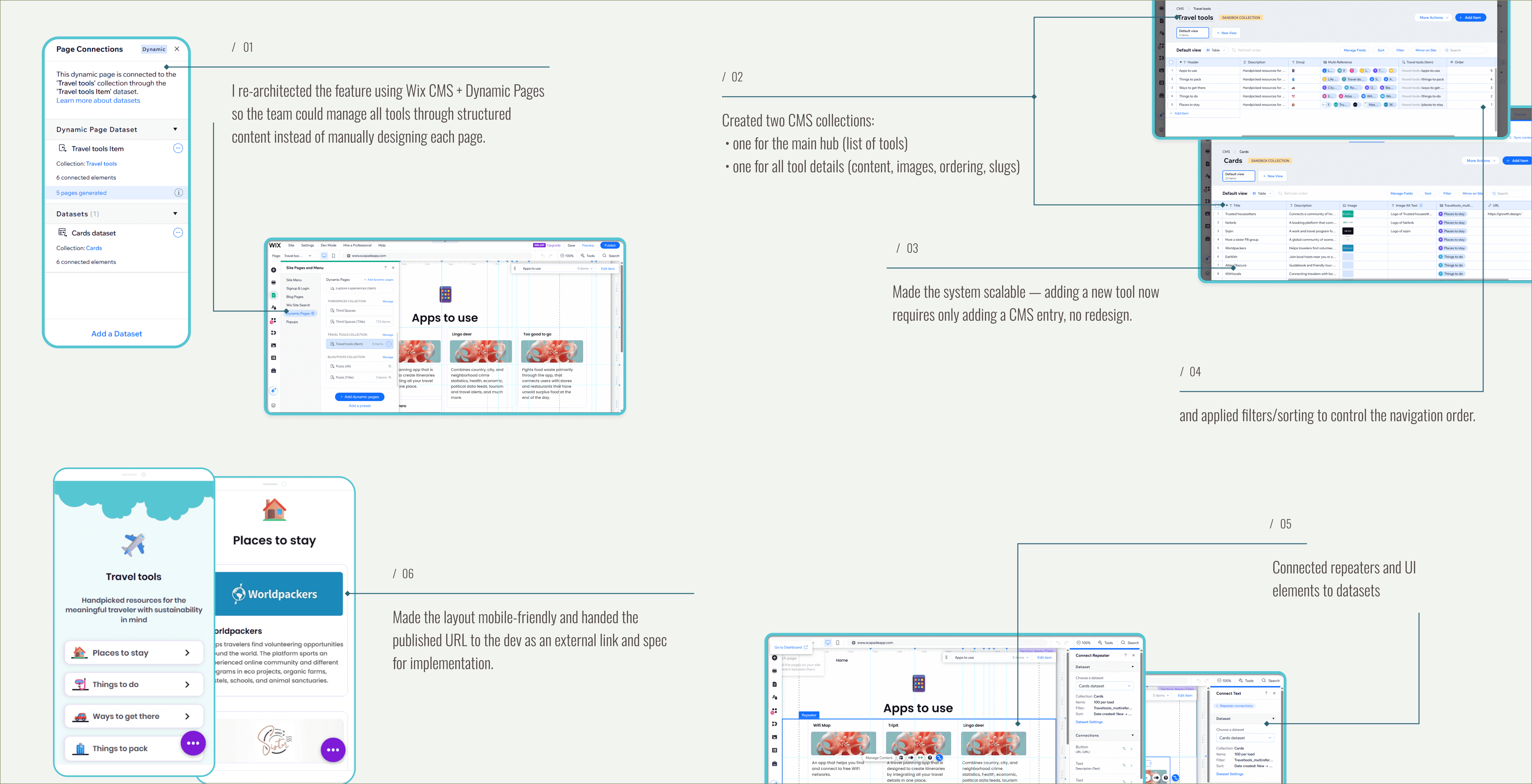
/1.1
What I did
Built a lightweight, CMS-driven Travel Tools hub and dynamic detail pages in Wix.
Modeled content with two collections (hub + tool details), used dynamic templates, repeaters, filters and proper slug/order logic.
Handed the published URL to the dev as an external link and spec for implementation.
/1.2
Result
Delivered a clickable, editable prototype that proved the UI and flows without costing development time.
Removed uncertainty for leadership and provided a production-ready content model, reducing dev effort and rework.
Made the feature scalable - adding tools requires only CMS updates, not redesign.
Design-to-delivery collaboration
/1.1
Constraint
Engineering team members did not have access to Figma, which required an alternative approach to design handoff and implementation clarity.
/1.2
What I did
Created 200+ pages of detailed design documentation, covering redesigned screens, new features, edge cases, empty states, and interaction logic.
Documented design rationale (“why”), not just visuals, including UX principles, trade-offs, and references to platform guidelines to support accurate implementation.
Produced separate flow-focused documentation for the Product Manager, helping align feature intent, user impact, and development feasibility.
Worked closely with the PM and developers in review sessions to identify implementation gaps, correct mismatches, and close logic loopholes during build.
/1.3
Impact
Reduced back-and-forth during development despite tooling constraints
Enabled the PM to reuse design documentation directly in engineering briefs
Ensured design intent carried through to production, even under tight timelines and system limitations